Symmetry is an emerging concept in web design when it comes to arranging different elements on a website. With symmetry we mean achieving visual balance and stability in a design. Balance is indispensable in order to create a truly beguiling web design. It enhances the user experience and gives better control over a design structure. A perfectly symmetrical design looks creative, refreshing, and appealing to the user.
In this post, I am going to talk about some basic principles of a symmetrical design and why it is important to create an aesthetically pleasing website.
Understanding the Basics of Symmetry
Functionality and impact are the two most important aspects in web designing. They are achievable, but only when your design looks clean and well-balanced. Symmetry is typically associated with balance. The main idea is to create two halves that are mirror image of each other. The elements are arranged in such a manner that a sense of consistency and stability can be attained.
Apart from this, there are also designers who play around symmetrical designs, where the two halves are perfectly balanced, but they don`t mirror each other. While symmetry has been a signal of flawlessness in web design, there are so many websites that are embracing this concept just to make sure that their design looks comforting and comprehensive to the user. Having users understand the design is actually a logical application that they are not going to be satisfied by gimmicks. Symmetry gives the visitor an ability to use the site, which is a key factor of a successful design. However, there are times, when symmetry can also over-board your website, so it is essential to understand that such kind of designs make more sense when you want to convey a neat and simple message through your website.
The concept of symmetry has been gaining popularity, and the proliferation of multiple devices and screen sizes are making it increasingly important for webmasters. By implementing it, you not only successfully bring uniformity in your design, but also a smooth flow from top to bottom.
Types of Symmetry
1. Reflection Symmetry
Also known as bilateral symmetry, Reflection is the most common type of symmetry used which results in producing “mirror” images around a central axis. With “mirror” effect, we mean when one object is reflected across a plain to create another one. The symmetry can take place in any direction: vertical, diagonal, etc. Reflection symmetry is mainly used to group certain elements, enabling website visitors to locate similar elements to ensure a delightful user experience.

2. Rotation Symmetry
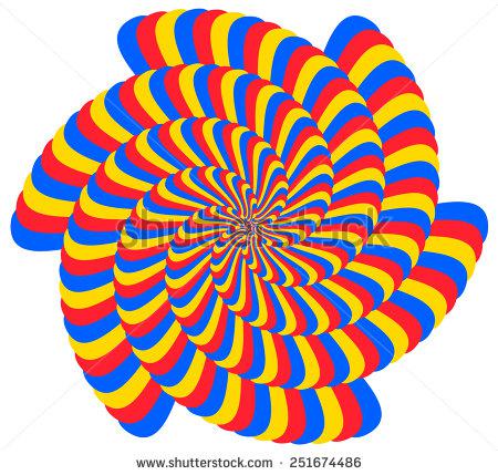
Rotation symmetry is also known as radial symmetry and is used to add movement to a design. The main idea is to rotate an object in a certain direction. It allows you to portray motion or speed in a design. It also conveys a dynamic action. The finest example of rotation symmetry is petals of a sunflower. However, when talking about design art, signs, letters, regular patterns can be considered examples of rotational symmetry.


3. Translation Symmetry
Translation symmetry is used to move an element to a different position while maintaining its orientation. It is commonly used for borders to hold more complex patterns “in line” on a two-dimensional space. Translation symmetry doesn`t mean that all the objects have to be of the same size. Look at the example below, the square here moves from the background to the foreground, and gets bigger when they come closer. This gives a sense a motion, speed, and dynamic action in a design.
4. Color Symmetry
Talking about symmetry, we mostly tied it with shapes and their arrangement, but it can also be implemented in color. Consider color wheel, it boasts a very intelligent symmetry across the wheel by featuring comforting opposites.
Colors and the way they are utilized have a massive bearing on the overall success of a design. Creating symmetry in color is important to make your site look engaging and soothing. That is why designers need to pay attention on creating symmetrical shapes and then blend them with harmonious colors to ensure a balanced look.
To Wrap Up
Symmetry in design is a strategical approach towards creating a website that`s easier and enjoyable to use. It helps designers to maintain an ideal balance between different elements of their website to instill points of interest, character, and uniqueness.
Author Bio:
Having massive experience in front end development technologies Samuel Dawson is a expert professional in Designs2HTML Ltd, a reliable PSD to HTML5 conversion company. Apart from he also shares his knowledge on the web.


